CUWiki needs a logo! Can you design it? Entries are open to all. ...
| Congratulations Matthew Farrell - his logo won a Parkland College design award! Time to adopt it sitewide. Details at bottom here..... |
Make sure the logo represents the Champaign-Urbana area and is a symbol we would want to represent ourselves. This logo will get used not just on the website, but around town in stores, on signs, at restaurants, on flyers, in schools, etc. So get creative!
To participate: Upload an image of your logo below. Add your comments or your vote at the bottom to help in the decision.
Very rough vectors from Jeff Ginger, #1-6:
![]()
![]()
![]()
![]()
![]()
![]()
#7 and #8, below: How about these? We've got the great concept of dialogue (which a wiki is) from the conversation bubbles, thank you Laura. Now let's use a font that says anyone can do it (this one is "laffayette comic pro") and fit it on one line so it can serve on the front page. And keep it orange and blue. And emphasize the U (you) over the C. Design help might be needed.
![]()
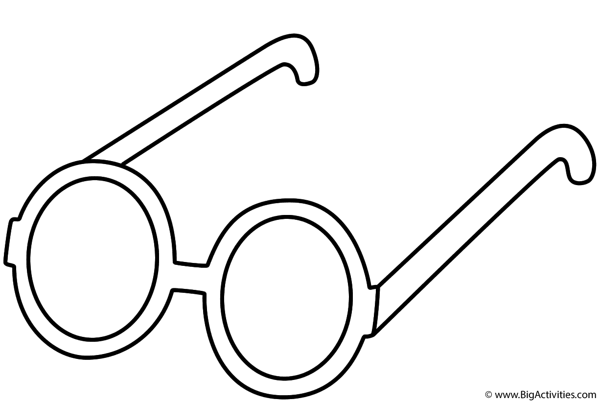
#9: Or, forget the conversation bubbles, as nice as they are. Go for C U (See You) in of course orange (glasses courtesy of here):
![]()
Hello! These are variations on a similar theme. I think the concept is strong for the "let's put our heads together", but the simplicity of the C and U without the faces creates an elegant and professional look, while still having the concept of community connectivity through the connection of the two letterforms.
The last version is my favorite. The dialog boxes created out of the C and U. Creative, simplistic, professional, and cool.
-Matthew Farrell
![]()
![]()
![]()
![]()
![]()
Here is a color version of the concept from the middle row, I even did a little creative copy writing, just for fun.
![]()
![]()
Comments and votes:
> I vote for #2 ... wait no 9. Hang on! How many times can we vote? (Mary A.)> I think #2 has the most potential her, but looking at what we've got so far, I suggest we need a professional graphic designer or good design student to submit -- CR
In response to the above comment, I am a local freelance designer and Parkland College graphic design student. I whipped up these concepts in about an hour and would like to refine them a bit more, but I believe this is a good start. Let me know what you think! -- Matthew Farrell
Matthew, I like #3 best and I wonder if your classmates would have any tweaks or comments. ... the cursive font and the bold wiki, that seems to say something friendly and strong. Is there anything that could be incorporated to situate it in our local community more? Or is that needed? -- katewill
I will ask my professors and fellow classmates what they think about these. I'm guessing they will like #5 most because of the strong concept, but who knows! I may be able to come up with something that fits it into C-U a little better, but that might be getting into overkill territory. I will let you know soon.
@katewill- I have spoken with my head professor and a few of my peers. The 5th version with overlapping dialog boxes seems to be a hit, with my professor suggesting that I use it in my portfolio. The concept is strong and execution is simplistic, utilizing orange and blue to symbolize C-U. The second choice was your favorite, image #3. The general consensus was that if this concept was used but needed to have more of a "C-U vibe", the best option would be to use orange and blue somehow. The use of orange and blue is the easiest way to show your target audience that this is indeed a Champaign-Urbana website. There are some other options that came up, and I would be willing to meet with you to discuss this in further detail. Because this is a logo, it should simply identify the website. The representation of the community comes within the content of the website. Of course, the logo should show that C-U knows good design, and that you will have if you go with either option. Necessary tweaks can certainly be made if you and the voters decide to go with one of these concepts.
Also, The way that the dialogue boxes create the letterforms of C-U is highly creative in my opinion. This creativity will display a level of intelligence that is a hallmark of our community due to the the fact that we are home to the University of Illinois. It is also a somewhat playful approach, which shows that we not only are smart, but we like to have a good time. The overlapping of the dialogue boxes also shows a connectivity of community, and demonstrates that CU wiki is a place to share information between community members and visitors. -- Matthew
Hey, this is great -- the ad and slogan is too -- Thanks Matthew! I see your points. If you think the other options are good, put them here. I'm going to encourage others to chime in, so we can make a decision with more people's input -- katewill
Hi everybody, Matthew Farrell here. I haven't seen any new posts in months about the logo. Just thought I'd let you know that my first color version of the logo (with interconnecting dialogue bubbles) won the Electric Pictures Award in the Parkland College Graphic Design Student Show! If you would like to have some movement toward application of one of my logo proposals, please email me at [email protected] and I would be more than happy to help you all out!
p.s-I can also help out with branding the website to better suit the look and feel of the logo if necessary. I look forward to getting in contact with somebody! -- Matthew

